
Building five products without making them look the same
The design system behind the portfolio is not a shared UI kit. It is a shared standard, worn differently by every product.

By Kapisch BhardwajFounder of OneKapisch
Published
Portfolio studios usually drift to one of two failure modes. Either every product gets stamped from the same template until nothing has a face, or every product goes its own way until nothing feels related. Five commercial products in, here is how OneKapisch tries to hold the line between them.
Reusable trust, not reusable UI
What the products share is a standard of behavior. Live in the menu bar if you belong there. Do one job. State the verified data boundary. Feel native to the platform. Avoid an account unless it buys something concrete. What they do not share is a skin. Each product keeps its own name, icon, accent, and visual temperament, because those carry its identity and its promise.
The evidence is on this site
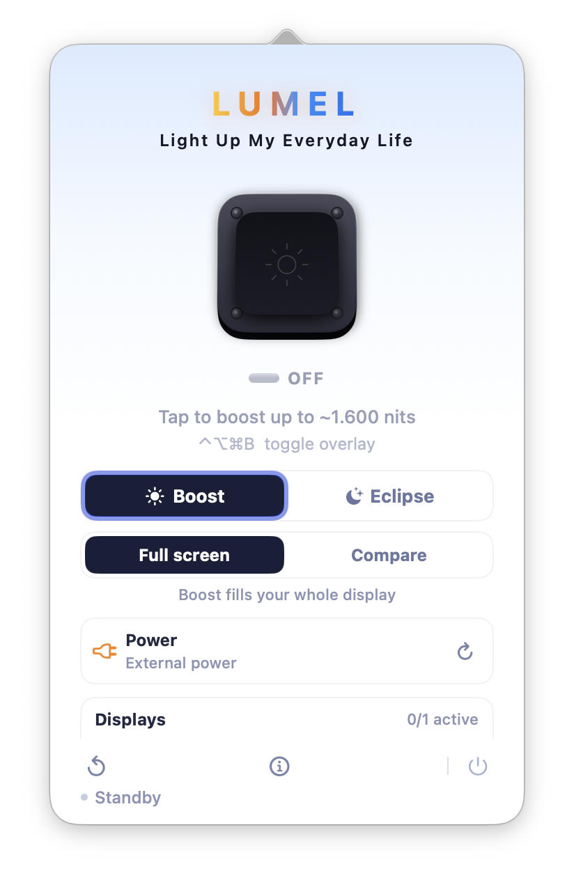
Look at the product pages side by side. Tokens 4 Breakfast lives in coffee-dark warmth with its green usage numbers, because it is a morning instrument. LUMEL sits in midnight navy with a golden sunrise glow, because light is literally its subject. SkyLocation is flight-deck blue. Clip 4 Breakfast is a bright stage with a magenta accent. Same standard, four different faces, and you can tell them apart at a glance from across the room.
Where sameness is correct
Platform labels use one consistent treatment everywhere because they answer a practical question before a visitor follows a product. The publisher block is also consistent because it is the signature, not the painting. Support routes, claim wording, and data-boundary statements stay aligned where the underlying evidence is the same, because trust language must not have dialects.
Where sameness is banned
A big OneKapisch logo never sits above a product’s own logo. The studio endorses; it does not headline. Product screenshots are never restyled to match studio branding, because a screenshot is evidence and you do not art-direct evidence.
The studio endorses; it does not headline.”
Why bother?
Because users meet products one at a time. Someone who finds LUMEL in a search for display control does not care about our portfolio that day. The product must stand alone. The studio identity earns its keep later, at the moment of trust: who publishes this, who answers support, and what else the studio presents. The test is concrete: a product screenshot should remain recognizable from across the room, while its page should make the publisher, verified boundary, and support route easy to find.